A New Website
July 13, 2015
I opened On Location Portraiture in 2000, and one of the first things I did was design and build my own HTML website. I had designed other websites before that, and I was proud with how mine turned out. At the time, my website searched very well, and was a lot slicker than many other photography sites.
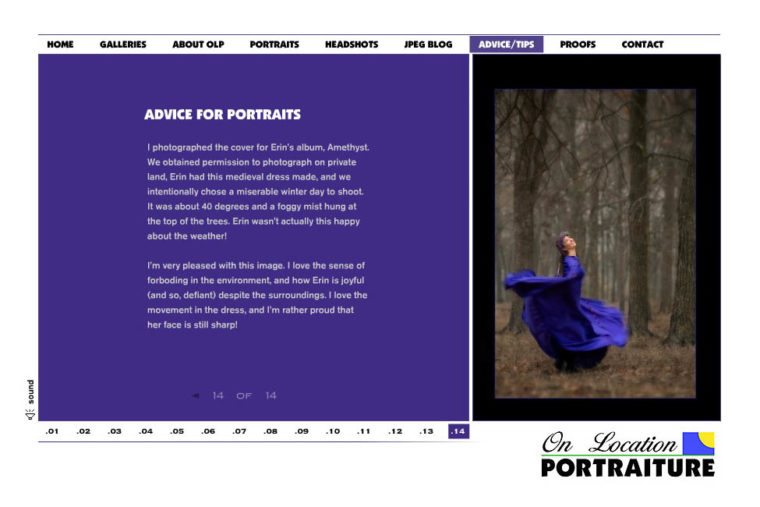
However, around 2005, Flash-designed websites came out in force. They didn’t search very well, but they looked 100 times better than just about any other HTML site, including my own. I kept my old HTML site in the background for the search engines, and tried to build my own Flash site. It didn’t go so well. Flash programming was lot trickier than HTML programming, and after a time I found a company whose business was to create Flash-designed website templates specifically for photographers. I started one Flash website using their template and ran with it as my portraits and weddings website for a few years.
Two new trends in photography websites came up as important after that. The first was to separate websites to focus on specific markets – build a website to focus on high school seniors, one to focus on families and children, and one to focus on weddings. I did just that, using Flash-designed websites for all three. The second trend was to blog. I did that as well, and stayed pretty active with it from 2007 to 2010.
And then – iPhones came out, and Apple began a war with Adobe over Flash-designed websites and apps. Flash briefly competed with Apple’s blossoming app store, and so Apple decided not to support Flash on any over their handheld devices. A year or so after that, Android smartphones and tablets also stopped supporting Flash. As hand-held devices became more and more popular, the need to have a website seen on them became more and more important, and all of my Flash sites became increasingly obsolete.
I’ve known I needed to change to a completely new website design for the last few years, but I’ve been torn about how to proceed, plus I’ve been too busy with client work to really focus on it. The middle of summer, though, is usually a slower time of year for me, and I’ve finally found an option that I like. I’m going with a WordPress-style website that will look great, search well, and will display just as well on a hand-held device as a desktop computer. Basically, I’m moving into 2015 and past 2010 – ha!
All this keeping up with technology can be exhausting, as you can imagine, and that’s one of the reasons why I’ve avoided social media sites like Facebook. To me, it would be another separate site to maintain, and social media tends to require constant attention. I have enough on my plate, and my current client work always has, and always will, receive priority. I’m simplifying things on this new website, and going back to one website that will have all of my work, plus a blog. It’s funny that after all of the changes in trends the past decade and a half, I’m going back to something not too different than the site I started in 2000. This new website will allow you to share items you like on social media if you choose, and I can always be reached by email or by calling 214-887-9996.
You’ll see new additions all during July and early August, 2015. That’s me adding information, galleries, and features as I have time. If you have any suggestions or questions, please let me know. Thank you!

